The fallout of moving fast and breaking things
Breaking customer trust is easy. A company’s business and way of working dictates the limitations and boundaries in which designers manage, operate, and deliver for end customers.
🌤️ Weather Report: 3 exciting personal news ☀️
- My post on 5 stories from 2 decades of design was noticed by an AWS manager, and he nominated me into Amazon Design social program (27K) where I will be writing weekly Linkedin posts on .....? I haven't started and don't have a lot to share, but wow. I hope you find inspiration in "just do it" attitude. 😮💨
- On 3/21, I am doing a talk to University of Chicago, and School of Art Institute on how to create great products and services that are long-lasting innovation through user research (jobs to be done methodology). RSVP
- I am expanding this newsletter content into video. Started youtube channel FAANGBOSS this week, hope you support by subscribing! 😄
On to this week's topic... Breaking customer trust is easy.
A company’s business and way of working dictates the limitations and boundaries in which designers manage, operate, and deliver for end customers.
I have worked in rigid company cultures biased for cutting corners in design, in leu for building and shipping. This results in validation of the product post launch instead of pre-launch.
This high-risk mentality is evangelized by Mark Zuckerberg, “fail fast and break things” but what he failed to explain the downsides between shipping MVP (minimum viable product), not MLP (minimum lovable product). No love in the first one 💔
Whose love is being broken? Your customers.
People believe breaking customer’s trust is not a big deal, because they don’t know how to fix it.
When users test out a new product for the first time, if it’s bad experience, the likelihood of them returning is slim. Why do people do this? Well, because they don’t know how to solve it, so they take the conservative approach called incremental changes. These changes are non-trivial, small, mediocre, and will never break anything.
ie. “This single button lead to $X million dollars for eBay, we took care of everything for the customer.”
If someone questions the power of the single button, the conversation quickly turns philosophical, “the best interface has no interface! And incrementally, we can remove the button in the future when we figure out how PhD the underlying system architecture and mask everything from the user!”
👩🏻⚖️ True Statement. Don’t ever question the god power of a button, or no button at all. Truly seamless.
Instead of failing by validating hypothetical perspective > launching > iterate. What if there is another way? How about “diagnose with data and treat with design?” - Julie Zhou
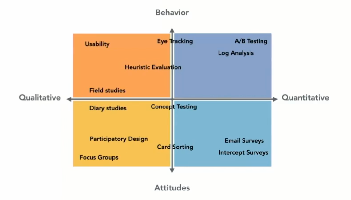
Gather empirical evidence, both quantitative and qualitative to de-risk failure rate for the team, and convert insights and findings to drive roadmap conversation for where opportunities are worth pursuing first.

When you are struggling to understand the problem:
- Take a high-altitude look at the leadership attitudes and business value the idea is creating. ie. You talk to your leaders, finance, data to indicate value is reported
- What is the flow of information exchange between people who are using it? Who is getting benefits, at what cost? ie. You gather existing data to understand motivational needs.
- Why is this proposed feature valuable for the business? What is the effort incurred to create? ie. Why this feature over another?
- How do I make this exchange less expensive? ie. Time to value, effort.
Design isn't limited to how the UI looks, it's the critical thinking required to articulate and demystify complexity in a product.
People can see "ugly" interface right away, so you can't hide behind bad visual design. Once you present your work, the critical thinking is on display. This comes in a form of design vision and scalability.
Help yourself and team by putting the customer first.
Have a good week ahead,


